La Torrefazione is a boutique coffee brand in Finland that blends coffee culture with a modern design language.
Highlighting the authenticity of coffee beans and the art of roasting, it offers a warm and welcoming experience.
The brand promises an aesthetic and unique atmosphere to both local customers and coffee enthusiasts.
At Dada Istanbul, while shaping La Torrefazione’s brand identity from scratch, we combined the cultural depth of coffee with the simplicity of modern design.
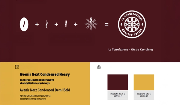
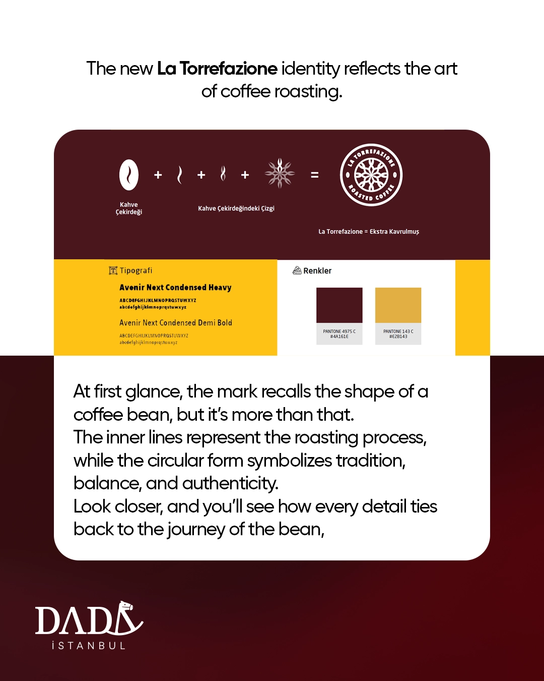
The logo design drew from the essence of the coffee bean, merging symbolic elements of the roasting process into a single cohesive emblem. This structure became more than a visual asset—it told a story rooted in the brand’s origins.
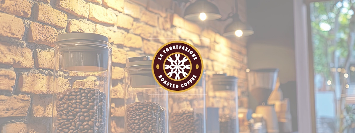
From corporate identity to packaging, from in-store applications to communication materials, the entire visual system was built on simplicity, trust, and elegance.
At every touchpoint, we created a sense of unity that supported the coffee experience with both aesthetic character and emotional connection.
As a result, the brand brought a fresh perspective to Finland’s boutique coffee scene, promising an unforgettable experience for coffee lovers.
La Torrefazione stands as one of the clearest demonstrations of Dada Istanbul’s branding expertise in the gastronomy and retail sector.
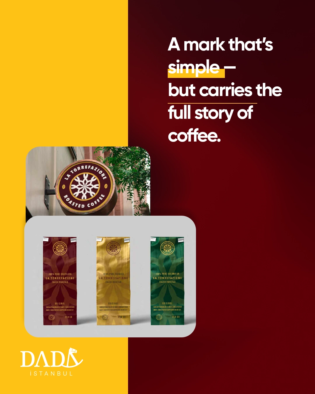
The brand identity was not just about creating a logo; it was built as a storytelling framework that consistently reflects the journey of the coffee bean across packaging, store ambiance, and communication channels.
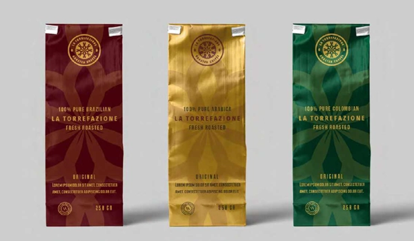
Packaging used distinct color codes to highlight the unique varieties and characters of coffee beans, while the store design was planned to provide customers with a warm yet refined atmosphere.
Digital visuals and communication strategies maintained this same consistency, ensuring the brand’s strong and memorable presence across both physical and online experiences.
Today, La Torrefazione harmonizes the rich tradition of coffee with modern aesthetics, positioning itself not only as a leading boutique brand in Finland but also as a timeless global reference in coffee culture.