La Sirena is a restaurant brand inspired by the sea, reflecting freshness, elegance, and the spirit of the Mediterranean.
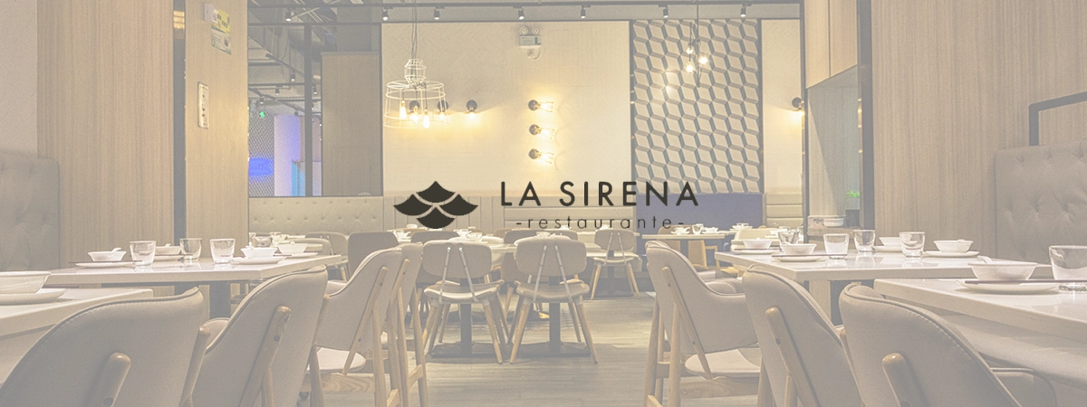
With its flavorful menu, modern design, and welcoming atmosphere, it offers more than just a meal—it delivers an experience.
The brand differentiates itself by combining traditional flavors with contemporary aesthetics.
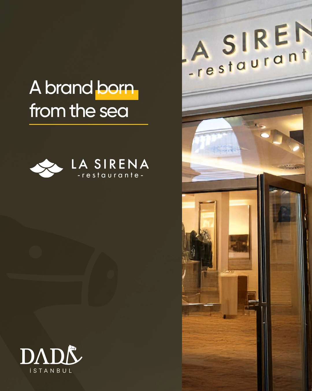
At Dada Istanbul, while creating La Sirena’s brand identity, we brought together the inspiring spirit of the sea with modern design principles.
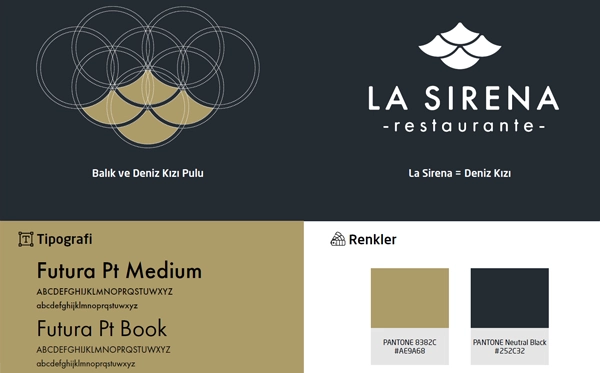
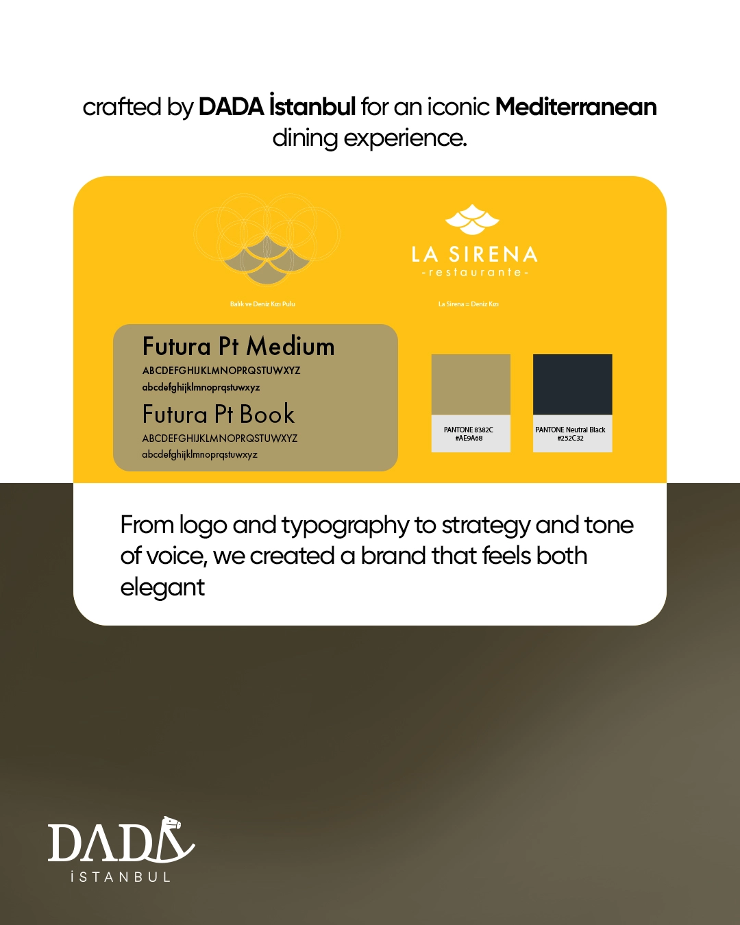
The logo was designed from an elegant marine symbol, consistently applied across all brand communications to strengthen recognition.
The color palette of blues and whites symbolized freshness and simplicity, while carefully chosen typography reflected the brand’s elegance and contemporary nature.
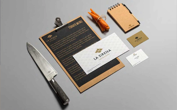
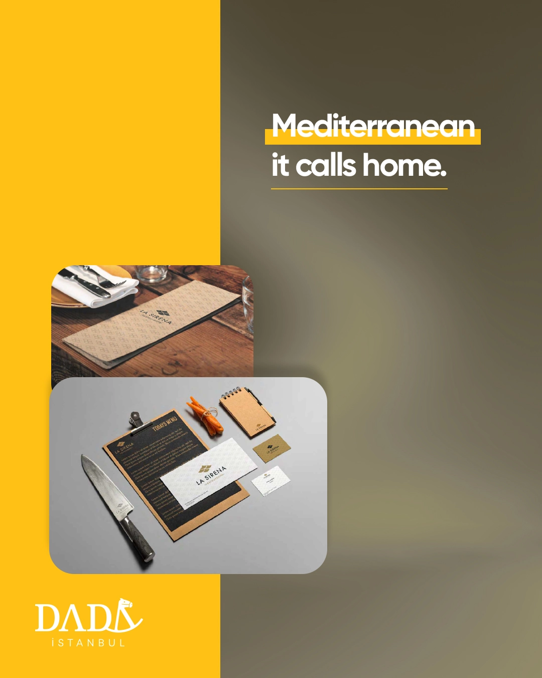
From corporate identity to menu design, from packaging to social media presence, every detail was structured within a cohesive system that embodied the maritime theme.
This approach allowed the brand to build not only visual consistency but also an emotional connection with its customers.
La Sirena is one of the strongest examples of Dada Istanbul’s distinctive brand-building approach in the gastronomy sector.
Its identity merges inspiration from the sea with modern aesthetics, delivering not just a dining experience but a complete brand narrative.
From packaging to menus, from digital communication to the ambiance of the venue, the same design language was maintained, ensuring a holistic brand experience.
This consistency helped position La Sirena as a trustworthy, stylish, and memorable restaurant within the industry.
Today, La Sirena stands out with its sea-inspired aesthetics and holistic brand experience, serving as a contemporary example not only in Finland but also in the global gastronomy scene.